After uploading the site yesterday, I made sure to click around the site live. For one, I was really proud that I got it up and wanted to bask in it a little bit. And secondly, I wanted to check all my links. Sure enough, I had one link that was incomplete, an internal link that had a typo, and a outgoing link that didn’t open in a new tab. Once that was all fixed, I took a look at it on my phone. And…………
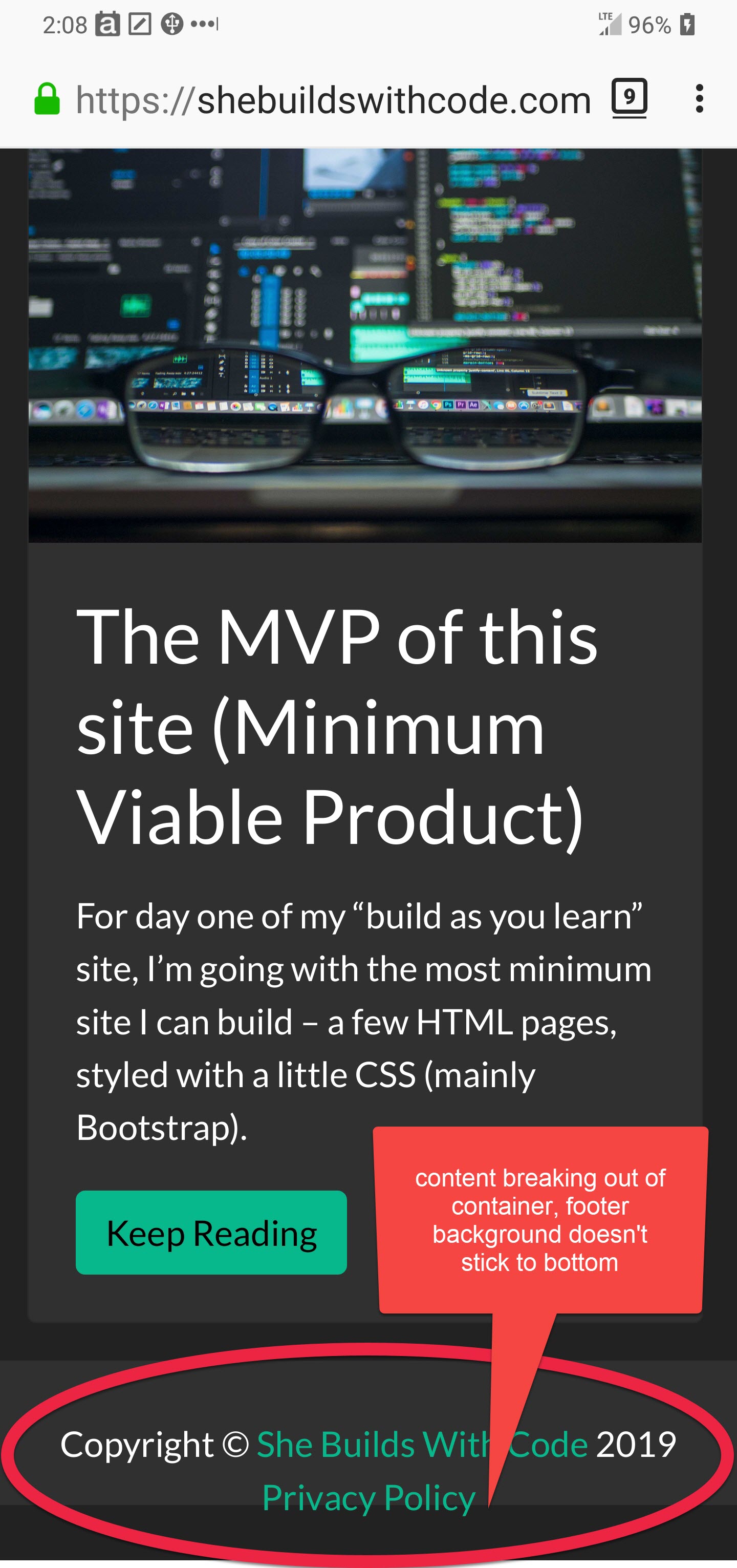
DAMMIT!!
In previous projects, I have struggled with getting my footer to stick to the bottom of the window. But each time I’ve fixed it, I’ve just copied and pasted code I’ve found. I honestly didn’t understand how it worked. This time, I was determined to make it make sense. Here are the key parts of my HTML:
<html class="h-100" lang="en-US">
........
<body class="d-flex flex-column h-100">
    <nav class="navbar navbar-expand-lg navbar-light bg-primary">
        Nav stuff here
    </nav>

    <main class="flex-shrink-0">
        <div class="container">
        </div>
    </main>

    <footer class="footer mt-auto py-2 bg-dark">
        Footer content
    </footer>
Full disclosure - I took this code directly from the Sticky Footer example provided by Bootstrap. But after I applied it, I played around in the Developer tools on Firefox turning styles off and on. I also missed applying a class to an item, and once I discovered that mistake, I felt I had a tiny better grip on how it all worked.
These classes applied to the body: <body class="d-flex flex-column h-100">
- d-flex applies flexbox display on the body element.
- flex-column changes the direction of all child elements to stack vertically, instead of the default row view of flexbox.
- and h-100 makes the body's height take up 100% of the available space, set by the parent element
As the parent element, this: <html class="h-100" lang="en-US"> was also applied to make sure that the page was displaying on 100% of the available view.
This: <main class="flex-shrink-0"> ...I'll be dead honest - I'm not completely clear on this. I know that by default, flex will grow and shrink elements in a container evenly by default. Telling it to shrink by 0 means the main content will not shrink in height (height instead of width because the parent container is displaying everything in columns.) And as the part of code I initially forgot, I know it's key to pushing the footer to the bottom of the screen.
So yeah....I've got a better grip, but not good enough to fully explain it. CSS is going to be a challenge for me in this project.
To wrap this post up, I’ve decided to start the #100DaysofCode challenge using this site. I’ve tried before, but quit early because I had no clear direction for how I spent my time coding, no end project in mind. This time, I’ve got clear mile-markers for this site, with a ton of stuff to learn along the way. Follow me on Twitter @SheBuildsWCode or sign up for email updates below!